

Project Overview
Most people have heard the phrase “there are starving children in the world” in an effort to get people to limit food waste. However, many people are uncertain of what to do with their excess food. While restaurants and grocery stores look for means to donate their surplus food, we recognized they don’t have the resources to do so in a timely manner. Therefore, we wanted to create an app to help bridge that gap and decrease food waste in the Austin area. Through this platform, restaurant owners and managers would be able to quickly schedule food donation pickups with local food pantries and donation organizations, track their food waste trends, and have a resource to reference for other methods of managing food surplus.
Team & Personal Role
Scope & Constraints
For this collaborative project, I acted as project manager to a group of four other teammates. I conducted interviews and user tests with members of the greater Austin area community, including two restaurant managers and the director of the Round Rock Serving Center. Additionally, I helped create our prototype from ideation of the paper prototype through the high-fidelity clickable prototype. Finally, with team input, I created the logo and style for the prototype.
This project was completed over the course of 4 weeks, collaborating virtually with my team. Our resources for contacts in the food service as well as those in food banks were slightly limited due to timing and communication difficulties due to Covid-19.

UX Challenge
Our team was tasked with creating an app that helped a social cause relevant to today's society. Our original intent was split between helping people who are hungry and addressing food waste. We found that we could address both problems at the same time and thus Food Fighters was born.
Our mission was to help fight hunger by reducing food insecurity while helping restaurants improve sustainability.
We found that this a real problem and the Environmental Protection Agency (EPA) recommends we look at solving food waste in the ordered displayed by the diagram.
We decided we develop an app that focused on source reduction, feeding the hungry, and composting.
Research Methods
In this research project, I created our team research plan and interview guide, conducted 2 one-on-one interviews, disseminated an online survey through social media platforms and contacts, and performed 2 user tests.

1-on-1 Interviews via Zoom

Online Survey via Google Surveys
Our team met and discussed that we had two distinct perspectives from the food business and from the food bank organizations. Therefore, we interviewed individuals from both and shared a survey.
Through our research we discovered on average, there is more food insecurity in the state of Texas than the rest of the US. We also learned that restaurant owners rarely donate food and are unaware of food donation organizations. In fact, a restaurant owner we interviewed said he often throws food away.
User Insights
Based on the insights we gained from all of our user interviews, we created an affinity diagram in which we recognized some key trends and repeating ideas.


A Slight Problem...
After analyzing our survey, we ended up developing insights from three different perspectives: The restaurant and grocery stores with surplus food, volunteers coordinating and transporting it, and donation organizations that receive the surplus. The insight showed us the issue is much bigger than we originally expected, and we ran into a roadblock: which persona do we choose to build the app around?
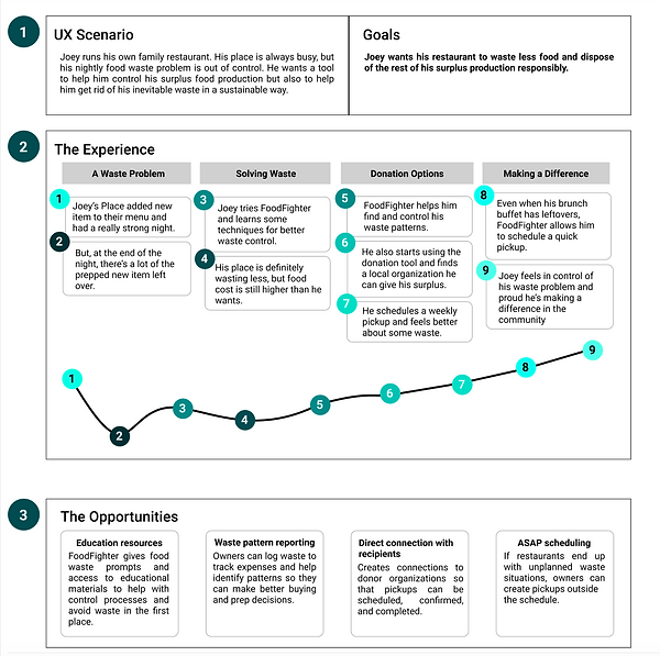
We ended up choosing a restaurant owner because it allows the user access to the entire process, from tracking and logging food surplus, to scheduling pickups and choosing their donor organizations. With this in mind, we created our user persona, Joey.
Competitor Analysis
Before beginning ideation, we looked into options already available. We found that websites such as food cowboy and replate shared our ideals by connecting food donors with recipients and educational resources, but they didn’t have a mobile app. Some were for-profit, had long processes, and required businesses to pay money to donate their food. Riley will now explain what features we decided to include in our own app.


Feature Priotitization
After analyzing our user insights we decided we wanted to focus on the donation process and tracking surplus trends.
User Journey Map
With our desk research, interview insights, and survey data, our team came up with a user scenario that we used to shape the functionality of our app. We took into consideration the downfalls of our competitors as well as the needs of a busy restaurant owner when using an app.
Paper - Prototyping
In creating our app, we started with paper sketches and made then clickable through Figma. We created the screens for the user task flows of scheduling a food pickup, looking at past food surplus trends, accessing the educational resources, and the logging waste functionality.


User Testing
Our first round of user testing was on a paper prototype made clickable through InVision.
The majority of testers seemed to be satisfied with the overall functionality and ease of use of the app. Many commented on how it was user-friendly.
The biggest pain points for the users came from either error in functionality of some of the buttons of the prototype or a desire for more specific features, such as pick-up history, pickup verification, and visual charts for the trends data. These issues gave us good insight on how to improve and expand the app functions.


Iterations
Based on user feedback and with our user persona in mind, we iterated on hierarchy of placement for buttons, unifying the design across features, and including recognizable icons adjusted for clarity to help guide the user. We also added alternate paths to allow a busy restaurateur to get to essential functions through multiple access points.
Style & Design

For our design, we used the material design principles of:
-
Hierarchy - shown through color, font, and elevation
-
Brand Expression - shown through consistent and intentional colors (green - sustainability and food)
-
Utilize elements that are recognized across different platforms to unify the user experience
Our design focused on clean, simple, and utilitarian design as users like Joey prioritize efficiency over fancy effects. In the fast pace of a restaurant environment, Joey needs to have the most important features accessible at the tap of a finger. And when he's done at the end of a long day, he need to have the information provided quickly and succinctly. Thus, our minimalist design with an emphasis on colors that align with the goal of our users such as Joey; sustainability, sustenance, and savings.

Second Round - User Testing
After adding style and iterating on layout and functionality, we conducted a second round of user testing. I found the following issues to be of primary concern:
-
Log surplus page: Switch the magnifying glass and bar code; the button order caused some confusion
-
Resource page: The donate symbol looks like you are donating money not food.
-
Schedule Pick Ups page: When finding details on scheduled pickups users were unsure if there was more info to be found. (The wording of the task might of caused this issue)

Final Prototype
After taking the results from our second round of user testing into consideration, we made further iterations on our wireframes. Our final hi-fidelity prototype walks through the original task flows listed previously as well as onboarding and login/signup.

Moving Forward
In the future, we want to:
-
Expand to grocery stores
-
Expand to donating scrap to animal shelters
-
Create a backend for food shelters to access & coordinate pickup schedules
In order to accomplish this, we will likely need further user interviews and testing as well as iterating further on our current processes.

Challenges & Strengths
The first major struggle we had in creating this case study involved narrowing down our ideas to one user persona. At first, the scope of the app that we had in mind was huge, and therefore, we ended up with three possible directions to go with our user persona. However, after one team member expressed made a case for how a restaurant owner or manager might use the app in ways that resonated with our original intent, we were able to rally behind that idea to come up with our final user persona.
Additionally, pulling our separate ideas and viewpoints into one cohesive prototype was trickier than expected. While the collaboration process went very well, finding a way to make our wireframes not look as if five separate people made them was difficult.
We would have liked to have had more user interviews within our intended user group. However, we had difficulties finding restaurant owners and managers who were able to take the time to work with us.
