

Project Overview
We were tasked with redesigning the desktop and mobile website for the National Oceanic & Atmospheric Association. The current NOAA site has several issues with clarity and often sends the user to various inconsistent websites rather than hosting its own content. In our testing there were also many issues of confusion with the navigation and information architecture. We worked to solve the problems caused by an confusing and inconsistent design by focusing on a clean, clear, and uniform design in the navigation and easy-to-understand organization of information on every page. We also aimed to condense the information into one main site rather than multiple sites with varying design.
Team & Personal Role
Scope & Constraints
As a collaborative project, I worked with my two teammates to research current pain points of the NOAA website, analyze & synthesize our user insights, come up with a general layout, make design and branding decisions, and create our prototype. While we began the design process coming up with individual ideas, we were able to come together to combine the best of each idea into one cohesive wireframe which we then used as the basis of our prototype. Additionally, along with my teammates, I conducted usability tests on our prototype and made iterations based on user feedback.
This project was completed over the course of 4 weeks, collaborating virtually with my team. Additionally, as this project was primarily focused on User Interface Design, our initial user research time was limited.

UX Challenge
NOAA is a parent organization for many other federal programs, and as such, their website is a landing page for many other organizations. However, despite large visuals and a pleasing color palette, the site proved difficult to navigate and frustrating to use. Our goal was to redesign the NOAA website to be easy to use and delightful experience without sacrificing the beauty of the visuals. Furthermore, we needed to make sure the wealth of knowledge that NOAA provides can be used by anyone looking to find it.
Research Methods
In this research project, I planned and conducted 5 one-on-one interviews and one stakeholder interview.

1-on-1 Interviews

Stakeholder Interviews
Initially, we interviewed 6 users and asked them to complete simple tasks using the current website. We found that many of the users struggled to find what they were looking for and were confused by the lack of consistency from page to page. Our users wanted a quick and easy way to navigate the site, however, they were required to click too many times to get anywhere. Out of 5 tasks, only one was completed by all participants.


Redlining the Current Site
Based on our user interviews and personal analysis, we determined that while the visuals were dynamic and appealing, the readability and functionality suffered due to the design.

Feature Prioritization Matrix
With the user insights we gained, we were able to synthesize the information into main features needed for the site. We then prioritized those features to help guide our process. Since the most significant issue was the navigation, our team focused on determining the best direction to go based on the user feedback received. We needed to take the following things into consideration: an easy way to navigate home, clear labels to identify iconography, consistency in breadcrumbs, and hierarchical organization of content.


Proto-Persona
Due to our limited time and resources for initial user interviews, we created a proto-persona based on both our user interviews and our own observations of the site. Though we recognized this proto-persona was limited, we were able to use her to get in the mindset of one of many different potential users of the site.

Information Architecture
Our first step in ideating on our solution was to take a look at the current navigation and, using the card sorting method, reorganize it into a new site map. We experimented with different ways to implement this new navigation before deciding on slide out tabs that are clearly labeled.
Inspiration & Ideation
We created a mood board to determine the general aesthetic, typography, and iconography that we wanted to use in our redesign. With this and the current site content in mind, we created lo fidelity wireframes.


Wireframes
We started with paper prototyping and moved into lo-fidelity in InVision before moving to mid-fidelity in Figma. After settling on our layout, we began applying style based on our mood board and the current NOAA branding.


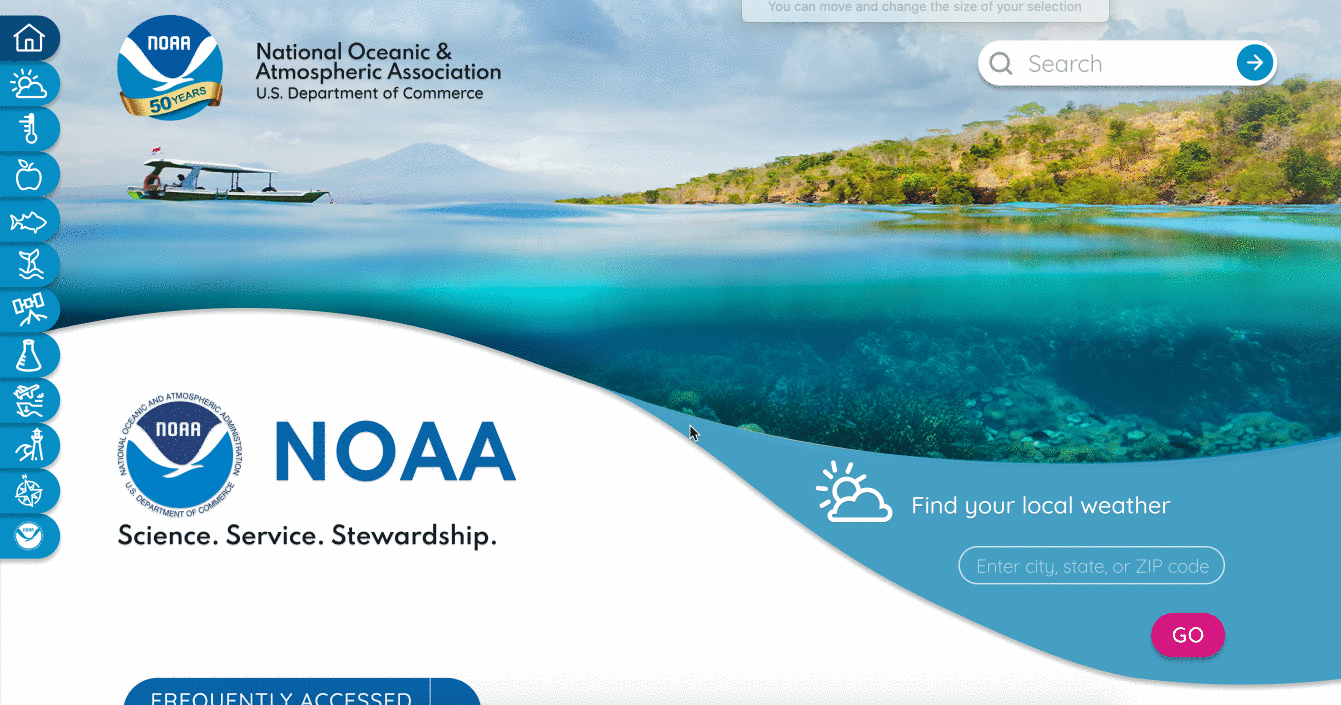
Desktop Nav
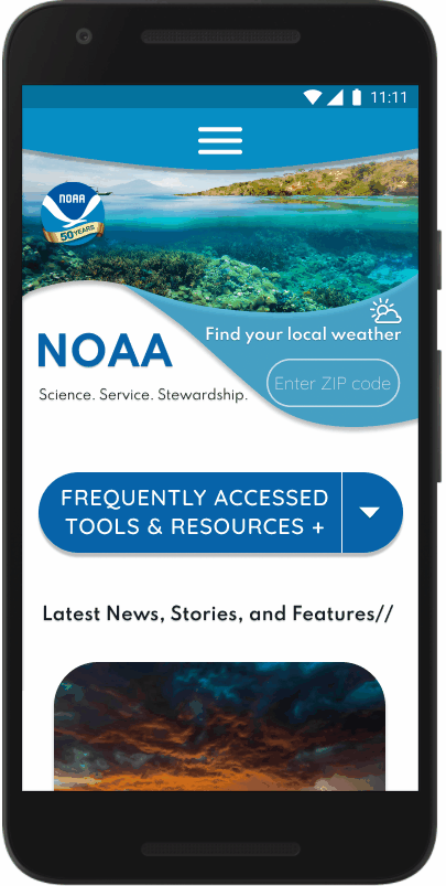
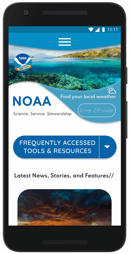
Mobile Nav

Navigation UI
Since navigation was one of the largest factors contributing to user confusion and frustration during initial testing, we made a concentrated effort to improve the UI. Our primary considerations were less clicks per action, more clarity in labels, and a secondary navigation bar to help with the depth of each department page. Additionally, we found the original sidebar navigation with icons was pleasing to the eye and unique for our users. With this in mind, we set out to increase usability while incorporating the aesthetic into our new design.
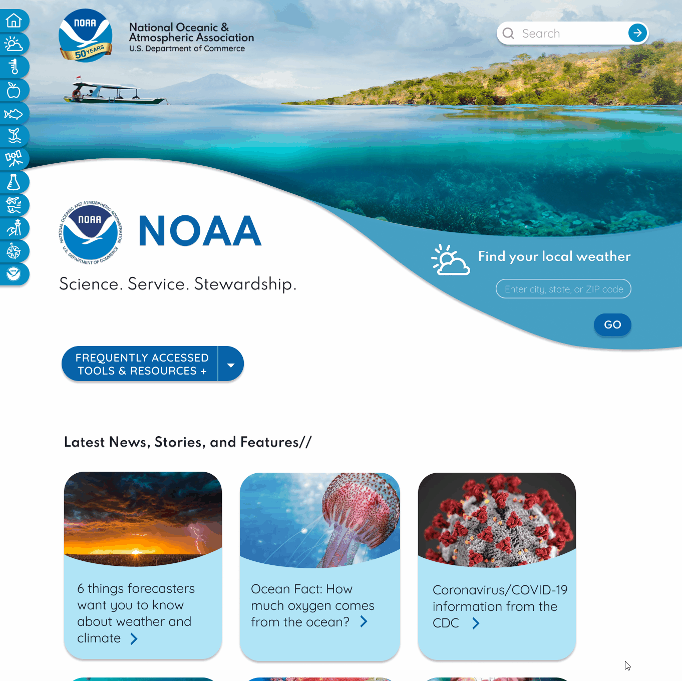
High-Fidelity Prototype
After performing some 5-second Usability tests on our navigation, we created a high-fidelity clickable prototype with our redesigned navigation UI, vibrant visuals, and clean, illustrative, & educational aesthetics.
User Testing
Our team conducted multiple usability tests including a 5 second usability test of the navigation, A/B testing on the layout of the cards, and structured task usability tests. We found that our success rate ranged from 90-100% for each task, and many users commented on how easy and fun the navigation was to use. The only major issues from user testing arose from strange wording of tasks that we adjusted, as well as some confusion due to the layout of our cards under an informational paragraph on our internal pages. Due to this, some of our users initially missed the cards and had to return to find them after looking elsewhere.

A/B Testing
We also A/B tested the size and layout of our cards on our mobile prototype. We found that majority of users preferred the larger cards stacked in one column rather than the smaller cards in two columns.


Iterations
With our user feedback in mind, we iterated further on our prototype, including changing the position of the cards from below the page summary to the top of the page, just below secondary navigation.
Final Prototype
Our final prototype included iterations on the home page header, layout of the widget, and even larger font for the body copy.


Moving Forward
In future iterations, I would like to add interactive aspects to the educational pages to entice young learners and expand the site to encompass all of NOAA rather than acting as a landing page for other organizations under NOAA.

Challenges & Strengths
The major struggles my team faced were rooted in the confusing information architecture of the original site and the fact that most pages opened to new sites that fell under the umbrella of NOAA. We had to go through multiple sites and pages to determine our new site map in order to condense and clarify the navigation of the site.
I would have liked to go deeper and build out more pages for the prototype in order to really showcase the cohesiveness of branding and style.
As a team, we really succeeded in making this project a collaborative effort. We impressed ourselves with how well we were able to mesh our ideas seamlessly into a final product.
Ultimately, this is a project that we would love to continue to iterate and improve upon in the future.