

The League of Women Voters Responsive Website Redesign
Project Overview
The League of Women Voters is a national organization with volunteer-run local chapters that provide both education and information on elections and the voting process and is well-positioned to fill a need in our democracy. However, we found that the Austin Area site was difficult to navigate, outdated in look & feel, and did not highlight the important features that users primarily want. We redesigned the Austin area chapter's website to be a more responsive, user-friendly, and aesthetically pleasing experience, including clearer navigation, emphasis on voter education resources and the voters' guide, and eye-catching colors and visuals.
Team & Personal Role
Scope & Constraints
I worked with a team of three other UX/UI Designers (David Ciccocioppo, Nick Pugliese, & Sunny Williams.) As project manager, I was responsible for guiding the team through the research and design process and setting the timeline. As a team, we shared the roles of UX Researcher and Visual Designer. From user and stakeholder interviews to wireframing and prototyping, we each share the workload among the four of us.
The most significant constraint on the project was timeline; we had just over two weeks to complete both research and design. The process was done 100% virtually, which also added some obstacles for collaboration and timing.

UX Challenge
Though women make up a large percentage of voters, their voices in politics seem to be underrepresented. The League of Women Voters Austin Area website provides a platform for women in the Austin community to disseminate non-partisan information that is beneficial to all voters. Therefore, we wanted to help redesign the site to be efficient and appealing in communicating this information in order to encourage more voters in the community to make informed decisions.
Research Methods
In order to gain user insights into the current site and public trends, I created a semi-structured testing plan and conducted 10 interviews with stakeholders, current users & potential users in the Austin area.

1-on-1 Interviews

Surveys

Stakeholder Interviews
Affinity Diagram

Key User Insights

Defining the Problem
We talked to several politically active women who vote to learn about how they research candidates and form their voting decisions. What we heard is that they are all very busy with work and personal responsibilities, and they would like to be better informed about their voting choices, but they simply don't have the time. We found that most have heard of the League of Women Voters, but many are unsure what they do or who they really are. Those who had heard of the League primarily knew them for their voters guide. When we introduced the users to the current League of Women Voters Austin Area site, we received strong feedback on the difficulty of use and confusion caused by the extensive text and outdated look and feel. The concerns from our stakeholders echoed those of the women we spoke with.
Project Goals
-
Give fresh updated look & feel
-
Provide easy guidance for navigation
-
Highlight voters guide and access to Vote411
Key Considerations
-
Brand standards are set for the League
-
Primary use is voters guide and voter info
-
Stakeholders desire to be more diverse
User Persona
After compiling and sorting all our user insights into an affinity diagram, we needed to get in the mindset of our users, so we created our user persona. This user persona helped guide our design-making decisions and user task flow.

UX Scenario & Storyboard
With our user persona in mind, we came up with the UX scenario and journey map upon which our storyboard and task flow were based. In order to make Alison feel like a real person, we considered what would be going on in her life and how that contributed to her use of the site.
 |  |  |
|---|
Information Architecture
Since the existing navigational structure of the site confused users like Alison in our initial testing, we performed a card sort and task flow to reorganize it.


Wireframes
With Alison’s needs in mind, we created paper wireframes and iterated into a mid-fidelity prototype. In order to design a responsive site, we started with mobile first and expanded to desktop.
User Testing
We tested 7 users one-on-one on both desktop and mobile with our mid-fidelity prototypes. Compared to initial usability testing, our users were able to navigate the site easily.


Iterations
We added style and iterated on functionality based on feedback from our users. Our key takeaways for iteration involved text and image sizing, button hierarchy, and more direction/explanation for the widget within the site.
A/B Testing
We also A/B tested a feature within our widget, with majority of users preferring A for candidate comparison.

Further User Testing
With our iterated hi-fidelity prototype, we conducted another round of user testing with 7 users. We found the results to be similarly successful, and the commentary on the style was mostly positive.


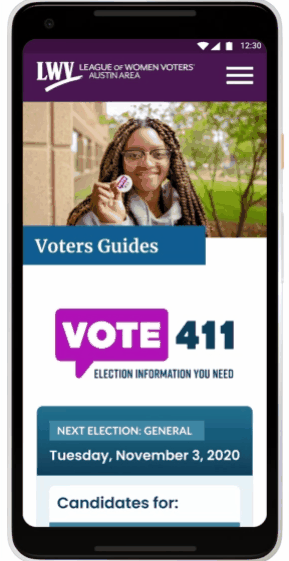
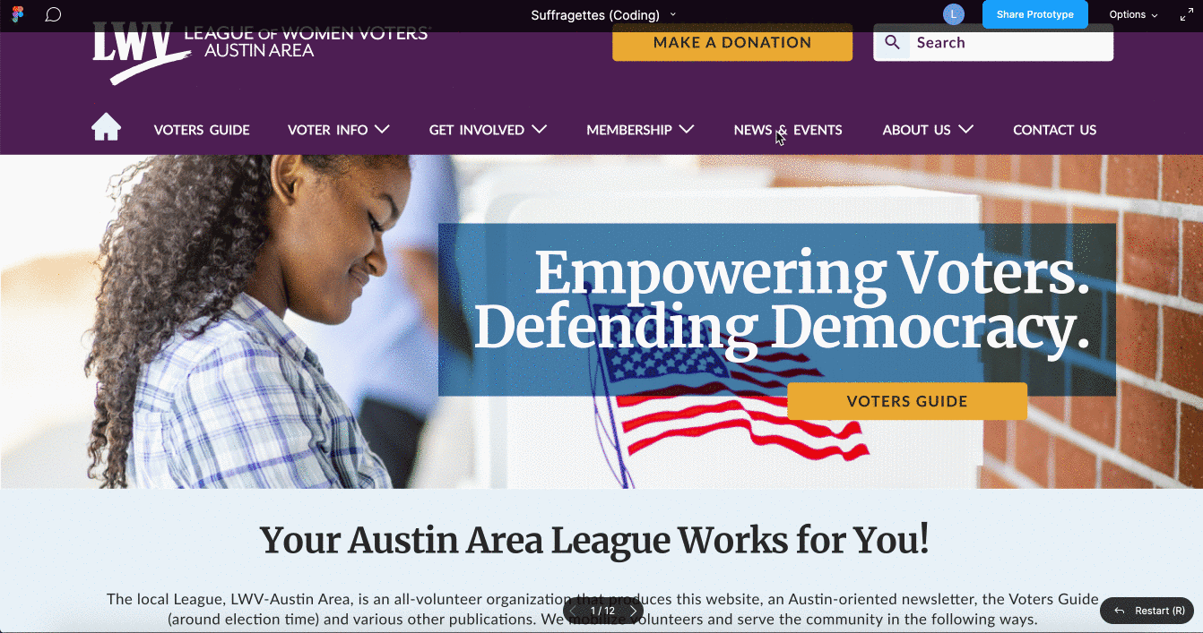
Final Prototype
Our final prototype included iterations on the home page header, layout of the widget, and even larger font for the body copy.


Moving Forward
-
We will add features such as a back to the top button on mobile as well as a members' area of the site.
-
The stakeholders really would like to move forward with a redesign, so we intend to continue meeting with them and adapt our design to the platform of their choice in order to develop a minimum viable product for the League to continue building on.
-
We also plan to do more user research to include a more diverse group based on feedback from our stakeholders.

Challenges & Strengths
The most difficult part of this project was reigning ourselves in on the number of pages and depth to which we wanted to build the prototype. Had we more time, we would have liked to build out the about page in order to showcase the personality and mission of the League of Women Voters Austin Area as that was commented on frequently during initial user testing.
One of the challenges we faced was the limitations on the direction we could go style-wise as the League already has a strict brand guide of their own. However, we feel our design gave the Austin Area chapter a differentiated personality while still meeting brand standards.
Additionally, due to the time constraints, we were unable to do more research after meeting with stakeholders. Had we more time, we would have liked to interview and test a wider range of users in addition to the current user base and those most likely to vote in order to develop multiple diverse user personas.
Our final product for the project was a shared effort and blend of style.